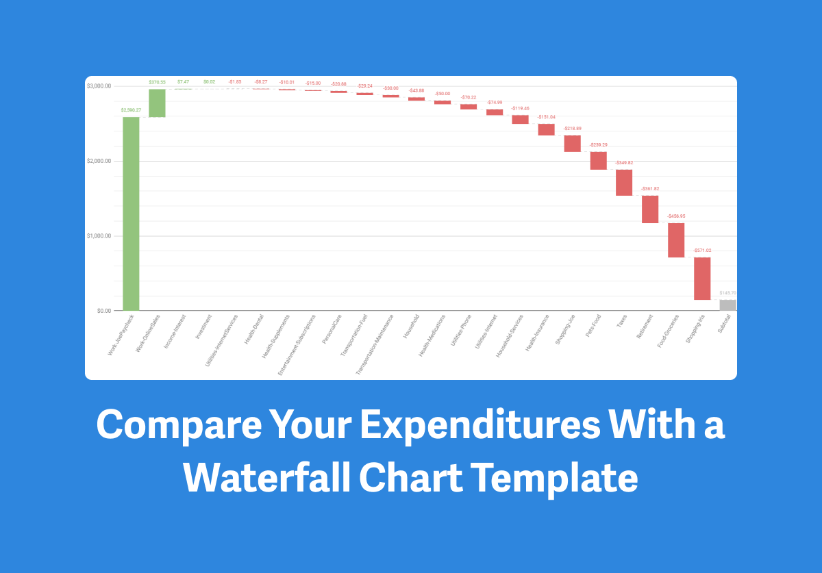
When it comes to understanding your money trends, a waterfall chart can show you how your income, spending, or savings totals are affected by positive and negative changes over time.
Because a waterfall chart is color-coded, it’s an easy way to visualize positive vs negative trends.
Tiller Community member Joseph Fieber recently built a Waterfall Chart for Google Sheets powered by Tiller Money Feeds.
This template is available for free in the Tiller Community Solutions add-on for Google Sheets
Here’s a quick overview of this helpful visualization tool directly from Joseph :
What is the goal of your workflow? What problem does it solve, or how does it help you?
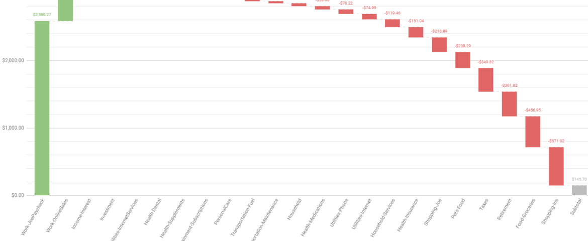
I use a ‘Waterfall’ chart to show category or group totals for selectable time periods and make how expenditures fit within income more apparent.
How did you come up with the idea for your workflow?
My wife doesn’t understand numbers. To help her understand where our money is going, I need to provide visuals.
Pie charts and Bar charts are OK for comparing categories to each other, but I wanted to include how expenditures fit within earnings.
While figuring out how to do that, I stumbled across the ‘Waterfall’ chart type, included in Google Sheets.
A waterfall chart shows how values add or subtract from a starting value. When referencing a sorted query, the chart uses vertical bars showing how your income was generated, and then a cascade of increasingly larger subtractions for each category or group, with a subtotal at the end showing the difference between your income and expenses.
Please describe your workflow. What are the sheets? Does it use any custom scripts or formulas?
Everything exists within one sheet that you can install via the Tiller Community Solutions extension.
Anything else you’d like people to know?
You can change the period of time you’re seeing transactions by using the ‘Period’ dropdown. You can change if you’re viewing by category or group using the ‘View By’ dropdown.
If you enter the description of your paycheck transactions in R3 (you’ll need to unhide the columns on the right side of the sheet by clicking the black triangle on the right side of the column P header), you’ll see additional paycheck options in the Period dropdown.
Note that the ‘Paycheck’ options will be most useful for those with a single major pay source:
- Current Paycheck – Enter your paycheck ‘Description’ in R3 (either the entire description or a unique portion). Period starts on the date of the first transaction with a description that contains R3, and extends until now.
- Previous Paycheck – Enter your paycheck ‘Description’ in R3 (either the entire description or a unique portion). Period starts on the date of the second transaction with a description that contains R3, and extends until the day before the first transaction with a description that contains R3.
- Since Last Sunday – Period starts on the most recent Sunday and extends until now.
- Since Start of Month – Period starts on the first day of the current month and extends until now.
- Previous Month – Period starts on the first day of last month and extends until the last day of last month.
- Since Start of Year – Period starts on the first day of the current year and extends until now.
- Previous Year – Period starts on the first day of last year and extends until the last day of last year.
- Number of Days – After selecting this period, B4 will become visible so you can enter a number. The period starts the number of days you entered before now, and extends until now.
- All – Period starts on the date of your oldest transaction and extends until now.
Is it ok for others to copy, use, and modify your workflow?
Yes, please, and please provide feedback on any issues you encounter and/or suggestions on how to make improvements!
How to get the template
This template is available for free in the Tiller Community Solutions add-on for Google Sheets.
Share your questions or feedback about this template
Visit this thread in the Tiller Community to share your questions and feedback.
