
About the Weekly Spending Analysis Report
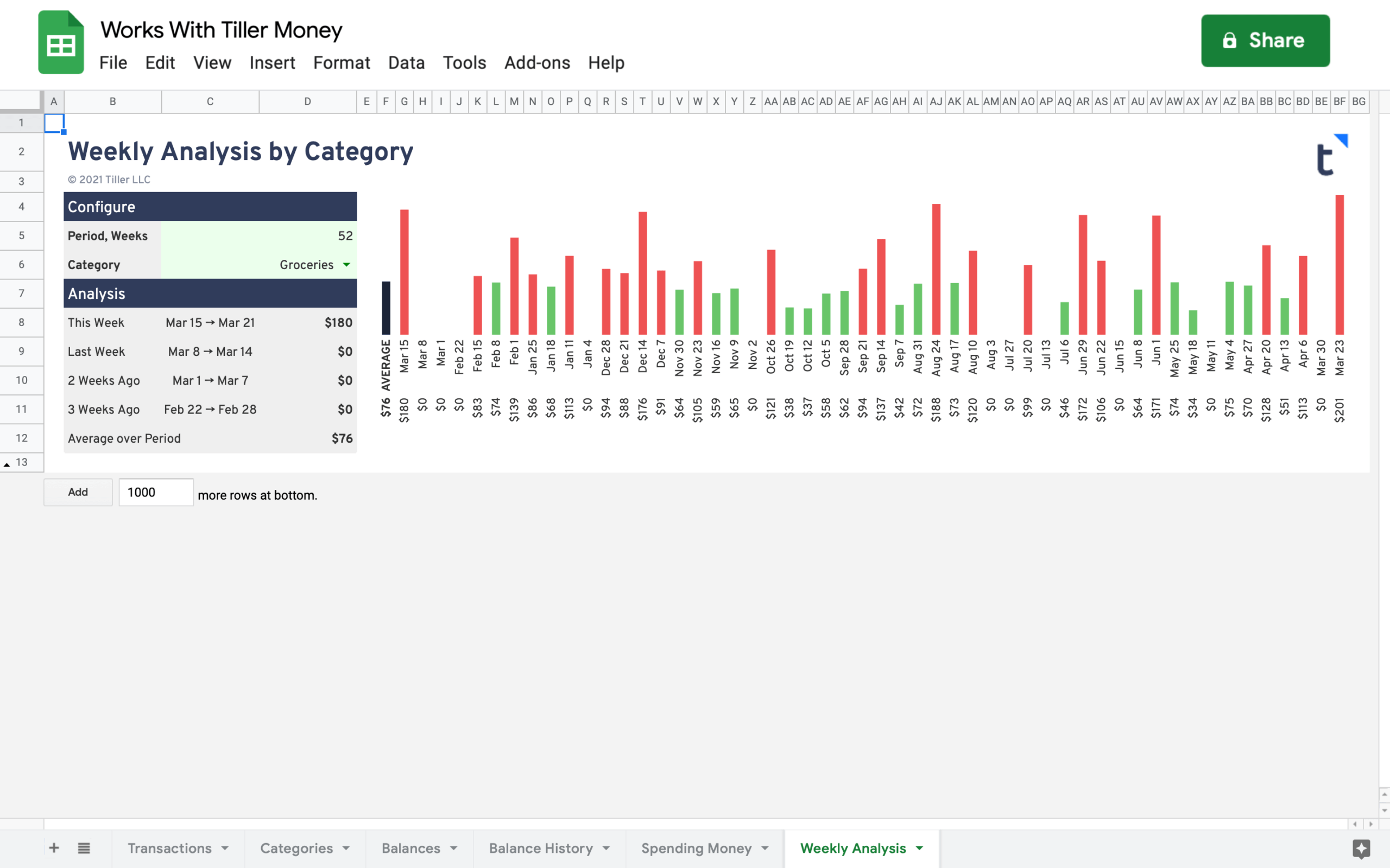
Quickly see how much you’ve spent in a specific category over a customizable number of weeks with the Weekly Analysis sheet. You’ll see the average across the number of weeks to the left and then the actual spending for that category charted out to the right.
Red indicates you went over the average that week. Green indicates your spending was below the average.
Support & Documentation
- View documentation for the Weekly Spending Analysis Report here the Tiller Community
- All Tiller Community Solutions are exclusively supported in the Tiller Community