

About the Spending Comparison Report
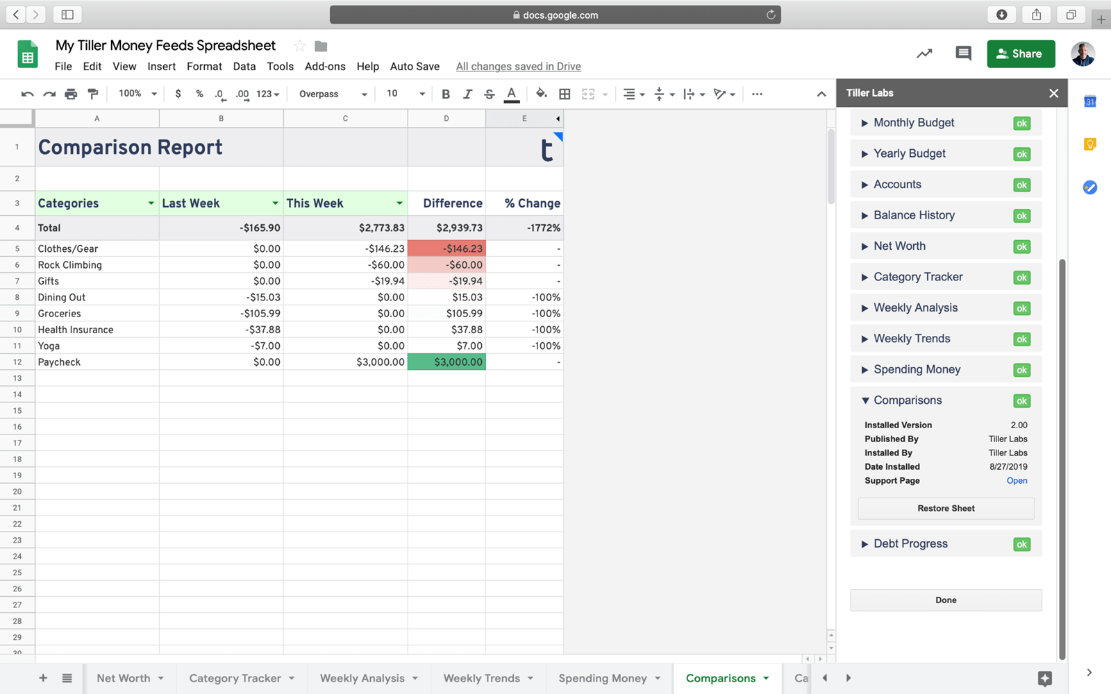
The Spending Comparison Report is an easy way to better understand your spending by comparing it across two time periods, including week, month, quarter, or year.
When your income or spending changes from one period to the next, you can gain a better understanding of what happened by looking at which categories or groups changed the most and least.
How it Works
Our financial comparison report is designed to help you gain those insights. The sheet compares your spending or earnings across any two different time periods you select. You can also select whether you want to view the report by categories or groups.
The sheet will then pull data from your automated Transactions sheet and provides a quick analysis of the difference in the total amount and percent change.
Support & Documentation
View documentation for the Spending Comparison Report here the Tiller Community
All Tiller Community Solutions are exclusively supported in the Tiller Community